Today is a perfect time to honor our healthcare professionals, celebrate international women’s month, and remind you to lather up. Consider it a threefer. All hail to midwives, nurses, and mom.
Poster from Foodsafetynews.com. October 15, 2016 was Global Handwashing Day, though we might have missed that.
Aqueducts and Aquamaniles APlenty
Contrary to some beliefs, bathing and hand-washing is not a historically recent phenomenon, but was a practice widely dispersed across many cultures for centuries. The Romans, Greeks, Mesoamericans, and Japanese all incorporated bathing into their daily routines. Even into the Dark Ages, where food was eaten mainly with the hands, it was customary to rinse off before dining. Special ewers were provided for noble feasters, but even commoners might prepare a hand-washing solution with herbs, like making tea.
Pour faire eaue a laver mains sur table mectez boulir de la sauge, puis coulez l’eaue et faictes reffroidier jusques a plus que tiedes. Ou vous mectez comme dessus camomille et marjolaine, ou vous mectez du rommarin, et cuire avec l’escorche d’orenge. Et aussi feuilles de lorier y sont bonnes.
To make water for washing hands at the table. Boil sage, strain the water and let cool to a little more than tepid. Or take camomille and marjoram in stead [of sage], or rosemary, and boil with orange peel. Bay leaves are also good.
On Day 2 of our Alameda County Shelter-in-place order, I am creating graphs, mostly for my sanity. Today’s topic is data, in particular, Covid-19 testing data. If you’re a data geek like me, this is for you.
I have blathered on for days (?or is it weeks? I’ve lost track…days seem like weeks) that our biggest problem right now is lack of testing. We don’t know what we don’t know. Because the U.S. didn’t roll out testing capacity early on, people who feel sick or at risk for Covid haven’t been able to get tested. We’ve heard that for weeks and are still hearing it. Because people who know they’re sick can’t get tested, we have no idea who is sick and how many would test positive. Without knowing that, everyone has to STOP moving. That’s the problem right now.
Yes, it’s definitely a problem that hospitals are starting to become overwhelmed and might become swamped. It’s definitely a problem that travel is cancelled and that there is a black market for toilet paper and sanitizers. (Anybody know where we can get some ramen? That turns out to be a big concern in our house.) It’s an even bigger problem that we don’t know how long this will last, and we won’t know until there’s a robust testing structure in place. South Korea put in an excellent testing structure early on, and they seem to be moving into a better part of the pandemic curve. We can learn something from their experience, and we can learn something looking at data.
The Most Important Data Is Under-Reported
The problem has been a lack of good data, and good testing data is still hit and miss. In a world that’s used to hitting the “refresh” button every minute and seeing numbers update, having data that is only reported every few days or not at all is killer to the psyche. Up until about a week ago, data on how many people were being tested was nearly impossible to find. This was due partly because few had been tested; I might also speculate that some didn’t want the public to know just how few that was.
I can illustrate this by looking at Daily Case data compared with Daily Testing data. Here is the number of cases in California, shown per day and total to date. By the way, note that the red bars (daily cases) are linked to numbers on the left side and the purple line (cases to date) linked to the right side. Showing data on different axes is important because if you show cumulative and daily on the same graph, the cumulative would make the daily increases too small to see. You would have no sense of the underlying infection curve.
Author’s Note:I considered taking this post down, since it was written before the declaration of Covid-19 as a pandemic, before the wave of infections and death hit the East Coast or, really, even Europe or California. I don’t want the tone to sound flippant. I’m opting to leave it up for two reasons. First, to point out that health experts did KNOW things before March 11 or March 20, or whatever date someone claims now is when Things Got Really Real. Secondly, it illustrates that even when knowledge is limited, people can take intelligent steps to minimize risks.There’s no better example than that photo of Mardi Gras as an illustration of what controlling risk means.
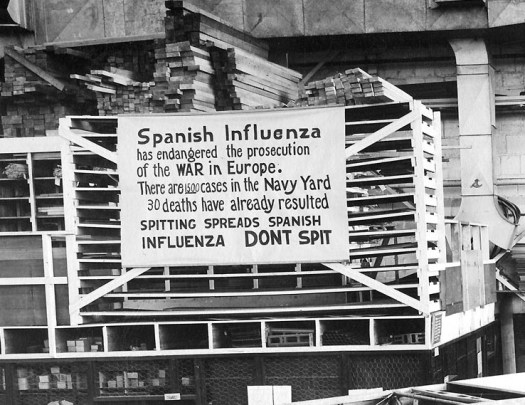
Spanish flu pandemic of 1918, photo from historyofvaccines.org
The question was asked yesterday: What’s something you’ve longed believed to be true, but now you know is not true? When it comes to worldwide problems, we often think: It can’t happen here. I mused about this while watching the news, with story after story about the coronavirus, topped by Our Leader at a press conference emphasizing that there are only 15 U.S. cases of the virus, and really that would soon be zero. That same day, the 60th case in the U.S. was confirmed, a case which is literally Here, near-ish to where I live. At the moment, they don’t know how the person became infected, and they don’t know who she came in contact with.
It can happen here.
Americans seem to sway between attitudes of invulnerability and full-scale panic. It can’t happen to us, that’s only for exotic people in China or Iran. Next day, we’re in long lines at Home Depot asking where we can buy HAZMAT suits. I’d like to take a middle road here and discuss some fact facts about pandemics—risks, likely scenarios, treatment, and precautions.
Lessons of History
There have been pandemics before, the most prominent being the Spanish flu pandemic of 1918, where 30 million people died. An estimated 500 million, 27% of the world’s population, became infected, and the death rate averaged around 2%. As many as 675,000 Americans died of the 29 million thought to have contracted the disease. The outbreaks occurred in two waves: one in the winter of 2018 during normal “cold and flu” season and a second, deadlier wave, in late summer. An unusually high number of young adults died in that second wave, unlike a typical flu. The disease hit hard even in isolated communities like the Pacific Islands and Alaska, with communities like Samoa losing 30%. In other places, such as the U.S., the mortality rate was closer to 0.5%. Not everyone was exposed. Not everyone exposed became infected. Not everyone who became infected died.
For comparison, a normal flu season in the U.S. kills between 20-40,000 people annually, about 0.1%. Like the coronavirus, the typical flu spreads when infected people cough or sneeze. People who die from the flu are usually those most vulnerable to respiratory diseases because their immune system is already compromised or they have other risk factors. Not everyone is exposed. Not everyone exposed becomes infected. Not everyone who becomes infected dies.